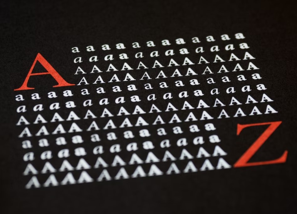
Dyslexia

What Is the Best Font to Use for Dyslexics?

Table of Contents
    Add a header to begin generating the table of contents

    A font is a graphic designer-made, uniform set of characters (letters, numerals, and punctuation) used for textual purposes. Readers with low vision, a visual processing disorder, or dyslexia may benefit more or less from the use of different typefaces. One such font is Dyslexie, which was created with the specific goal of aiding readers who struggle with visual perception. Other factors besides font size, text colour, and background can affect readability and reading speed as well.

    For kids who are still building their literacy abilities in the classroom, working with text that is easy to read when generating written work on a computer is crucial. If dyslexia is a problem, reading can be stressfully interrupted by visually distracting fonts or by the confusion of letters that look similar. As a result, it may be helpful for parents and educators to introduce a child to a variety of fonts that are accessible to people with dyslexia and then make adjustments based on the child's preferences.

    As a corollary, adapting computer screens and word processors to display a typeface that works best for each individual student is possible. Keep in mind that there are numerous types of dyslexia, and consequently, no single dyslexia font can accommodate all of them. If you're looking for a private school Melbourne that offers individualised attention, a dynamic curriculum, and a nurturing community, you've found it. Apply now to secure a spot for your child.

    What Is Dyslexia?

    It is estimated that 17% of the global population has dyslexia, a reading and writing disability. Some of our brains have a neurological learning disorder that makes it hard to recognise the letters and words around us and associate them with the correct sounds. The primary effect is a slower reading speed, but there are also secondary effects that can affect comprehension and retention.

    A user with dyslexia may have a different experience depending on the design team's approach to the content, font selection, typographic details, and colour combinations. Letter switching, mirroring, and merging are the most common causes of confusion for dyslexic readers.

    Some Fonts Are Easier to Read

    Dyslexia

    Height, weight, and shape are only some of the ways in which letters vary. Typefaces are collections of fonts that are standard on most word processors. Sans-serif fonts, which have a modern and straightforward appearance and lack any unique flourishes at the end of strokes, are the most prevalent types for web publications.

    Take the capital letter E, for example; its middle bar can end in a serif or a vertical line. This line is unnecessary in a sans-serif typeface, making it easier to read and making the font appear sleeker. And they're often easier to read for those with dyslexia than other font families.

    Verdana is a popular sans-serif font designed by Microsoft's in-house designers to be readable in small sizes and on low-resolution displays.

    Type Specifications

    You can pick from a wide variety of typefaces, each with its own style, size, and weight. Some fonts are simpler to read for people with dyslexia than others. For most people who are not dyslexic, the "feet" on the letters in serifed typefaces like Times New Roman and Garamond make reading much more comfortable.

    Serifs might make it harder for those with dyslexia to make out the individual letterforms. Sans serif fonts (like Arial or Comic Sans—yes, you read it right) are recommended here since they have a more handwritten feel, and each character stands on its own. But there are some sans serif fonts that can be trickier to read than others.

    It's easy to mix up letters that look too similar to one other, such as "rn" and "m" or "I" and "l". Since many dyslexic readers rely on recalling visual shapes, ascenders and descenders on letters like "b" and "p" need to be emphasised. Letters that are mirrored, such as the letters "b" and "d," might make reading more difficult.

    Pay close attention to the following points when helping someone with dyslexia with print or on-screen work:

    • Font sizes between 12 and 15 points are recommended.
    • Always capitalise the first letter of each word, but don't overuse them, or they'll become unrecognisable.
    • Using italics and underlining to emphasise words is also counterproductive.
    • Make headers 20% bigger than the rest of the text.
    • It may help to set the header style to bold to help differentiate it from the body text.
    • Use a suitable column width and keep text aligned to the left (45–75 characters).
    • Avoid using tight tracking and leading since this might make the letters and text lines appear to blend together.
    • When printing, use glossy paper sparingly and on backgrounds of light colour.

    What Makes a Font Dyslexia-Friendly?

    Most typefaces were developed with aesthetics in mind; however, some practical variants for people with dyslexia have been made available. Some people who have dyslexia may have trouble telling between particular pairs of letters. However, altering their size, weight, and central axis can be helped. You may also tilt it and play around with the negative space to make it more recognisable as a shape. The apertures of letters made from circles can be made larger, and the vertical parts of some letters (called "extenders") can be made longer, for instance.

    Graphic designers can improve readability by reducing the likelihood of typos by giving each letter its own distinct look. The b/d and p/q mirror pairs are ideal for this. It's useful for the letter l, the number 1, the letters f and t, and the sounds a and o.

    An individual with dyslexia may mistake the letters rn or m for each other. Designers can decrease the possibility of this mistake by modifying the arch's shape and the width of the letter r.

    Certain typefaces emphasise capitalisation and punctuation by making them bold. Students with visual processing impairments may also benefit from these modifications.

    Readable fonts

    • The recommended font size is 12-14 point (or its equivalent in other units, such as 1.2em / 16-19 px). Bigger font sizes may be requested by those who are dyslexic.
    • Inter-letter and character spacing (also known as tracking) should ideally be around 35% of the average letter width to maximise legibility and reading. An excessive amount of letter space might impair readability.
    • Minimum word spacing of 3.5 times the letter spacing is recommended.
    • Line spacing should be 1.5 times as large as the spacing between words or 150% as large.
    • Never use underlining or italics unless absolutely necessary; they make the text look cluttered and make it seem like it's running together. It is recommended to emphasise using bold.
    • Do not use all uppercase or small caps, as this can be confusing to the reader.

    Headings and structure

    • Make sure your information is easy to navigate by using consistent headings and formatting.
    • The heading font size should be at least 20% larger than the body content. You should utilise bold if you need to draw attention to something else.
    • Help people who use assistive technology by properly formatting their writing with things like justification, indents, lists, and line and paragraph spacing.

    Colour

    • Backgrounds should be a single colour. It's best to have a plain background without any distracting images or objects around you.
    • Make sure there's enough of a difference between the background and the text.
    • Do not use white for the backdrop, but use dark colours for the text.
    • Those with colour vision impairments may have trouble with the colours green and red/pink, thus, they should be avoided (colour blindness).
    • Think about replacing the white in your whiteboards, computers, and other visual aids with a different colour. Sometimes the colour white might be overpowering. You should go for a creamy white or a pastel colour. Some people who are dyslexic may prefer a different shade.
    • Keep in mind to print on matte paper instead of glossy. A sufficiently thick sheet of paper will prevent any bleed through to the opposite side.

    Layout

    • Align text to the left, with no margins.
    • Don't use too many columns (as used in newspapers).
    • Avoid having lines longer than 60-70 characters.
    • Remove unnecessary elements and similar group content by using white space around words.
    • Use section headings and a table of contents to organise lengthy writings.

    Other Dyslexia Fonts 

    Dyslexia

    Gill Dyslexic

    Christian Boer, the designer of Dyslexie, also made this font for people with dyslexia. It's unclear why he made two fonts instead of just one, however one of them is cheaper than Open Dyslexic and may have been made to compete with it. However, its overarching goal is to lessen the visual similarity between letters.

    Similarly to Dyslexie, the bases of the letters are thicker than in typical typefaces, making it easier to find the right orientation. 

    Read Regular

    Like Gill Dyslexic, this dyslexia font was designed by Natascha Frensch of London's Royal College of Art. It's not yet available for purchase or as open source.

    It's being used by at least one major publishing house, although acquiring a copy of the font remains elusive.

    Continuity between scenes is not sacrificed, and each individual character is intended to function in tandem with the ones that came before and after it. In order to stand out, the font's ascenders (bdfhkl) and descenders (gjpqy) are significantly longer than those of most others. The o, e, a, and u have more breathing room, and the e and g don't seem to close in.

    Lexia Readable

    Lexia Readable, created by Keith Bates of K-Type and sold on their site, is an older-audience-friendly update on the Comic Sans font family (i.e. not just comic books). We worked to make it readable down to an 8-point font size.

    Users, institutions, and causes can use the Regular and Bold weights without a licence fee. Packages with licence fees are also available.

    Dyslexie and OpenDyslexic both have long ascenders and descenders, liberal letter space, and an asymmetrical lowercase b and d to aid in legibility. Findings from any investigation into the typeface came up empty.

    Sylexiad

    This font was designed by Robert Hillier, a dyslexic person, for dyslexic adults. Hillier has contributed new information to the field of dyslexia typographic research through his research, observation, and testing with both non-dyslexic and dyslexic persons.

    The subject of dyslexia typographic study has advanced thanks to Hillier's research, observation, and testing with both non-dyslexic and dyslexic persons.

    This font was designed to look handwritten while still being legible, therefore, it has features like wide word spacing, consistent strokes, and long ascenders and descenders.

    Comic Sans

    Comic Sans is successful despite the fact that it is not well appreciated by designers. Due to the varying character heights, it was recommended as the best typeface for dyslexia. The fact that some readers find success with Comic Sans despite its unprofessional and childlike appearance is undeniable.

    Whereas many other fonts reuse the same forms for multiple characters, Comic Sans only does so for the "b" and "d," which are mirror images of one another. Consequently, Comic Sans allows for simple character recognition.

    Verdana

    Verdana was created with small text in mind. If you're dyslexic, you might appreciate Verdana's large x-height and its general accessibility. This typeface has loose tracking and wider dimensions than other sans serifs, making it easier for people with dyslexia to read.

    Verdana's high x-height makes it suitable for large apertures and helps to maintain visual distance between individual strokes. Verdana's design intentionally creates visual contrasts between characters that might otherwise appear to be the same, which improves the readability of the copy.

    A distinctive feature of the uppercase "I" that sets it apart from the lowercase "l" is the presence of two horizontal strokes, one at the top and one at the bottom. The number 1 also features a distinguishing horizontal stroke at its base, making it distinct from the letters 1 and 1.

    Sassoon

    Despite its reputation as a font for those with dyslexia, it was really made for younger readers. It's available for purchase via Adrian Williams Design and other online retailers, although it's pretty pricey. 

    Ascenders and descenders are exaggerated to highlight word shapes, and letter shapes are comparable to those used in schools to teach handwriting.

    Those with dyslexia may have a far more difficult time reading certain typefaces, both online and in print. In this blog, we'll introduce you to some of the suggested typefaces for use in creating products that may be read by the widest possible audience.

    Those who are dyslexic may be aware of a wide variety of texts, the appearance of which varies dramatically depending on the typeface chosen.

    The strokes (as in most traditional fonts like Georgia or even Times) of a font, especially a Serif typeface, hide the shapes of the letterforms in a way that is not the case with other fonts. So, sans-serif fonts tend to be the most often used. Therefore, many dyslexic people, being more accustomed to a typeface that looks almost like handwriting, have it recommended by their teachers.

    So, it's possible to be confused between "oo" and "rn" or "oa" and "m" in most of those typefaces.

    The relative heights of the ascender and descender (the 'stem' on letters like y) are also significant. People with dyslexia often have trouble remembering the correct letter configuration for words. Words created with short ascenders and descenders might make reading the text more laborious and possibly lead to an inaccurate interpretation if the reader is not careful.

    FAQs About Dyslexia

    It's linked to genes, which is why the condition often runs in families. You're more likely to have dyslexia if your parents, siblings, or other family members have it. The condition stems from differences in parts of the brain that process language.


    There are many forms of dyslexia, and not everyone diagnosed with it experiences reading this way. But seeing nonexistent movement in words and seeing letters like "d", "b", "p", and "q" rotated is common among people with dyslexia.


    Though there's no cure for dyslexia, early assessment and intervention result in the best outcome. Sometimes dyslexia goes undiagnosed for years and isn't recognised until adulthood, but it's never too late to seek help.


    You probably will read slowly and feel that you have to work extra hard when reading. You might mix up the letters in a word — for example, reading the word "now" as "won" or "left" as "felt." Words may also blend together, and spaces are lost. You might have trouble remembering what you've read.


    In fact, despite reading ability, people who have dyslexia can have a range of intellectual abilities. Most have average to above-average IQs, and just like the general population, some have superior to very superior scores.


    Conclusion

    Textual fonts consist of letters, numerals, and punctuation. Typefaces may help dyslexic readers. Dyslexie is a font designed for dyslexic readers. Dyslexics can read some fonts better. The condition makes reading easier with serif typefaces like Times New Roman and Garamond.

    Sans serif fonts, like Arial or Comic Sans, look handwritten and stand alone. Dyslexia-specific typefaces exist. Giving each letter its own look helps graphic designers reduce typos and improve readability. 12-14 point font is advised (or its equivalent in other units, such as 1.2em). Natascha Frensch designed Open Dyslexic, a dyslexia font.

    Typefaces with thicker letter bases are easier to orient. One major publishing house uses it, but getting a copy is difficult. Keith Bates of K-Type created Lexia Readable, a Comic Sans update for older readers, which they sell on their site. Verdana's design deliberately contrasts similar characters. The expensive dyslexia font Sassoon is sold by Adrian Williams Design and other online retailers. Letter shapes and ascenders and descenders are exaggerated to emphasise word shapes.

    Content Summary

    • A font is a graphic designer-made, uniform set of characters (letters, numerals, and punctuation) used for textual purposes.
    • Readers with low vision, a visual processing disorder, or dyslexia may benefit more or less from the use of different typefaces.
    • Other factors besides font size, text colour, and background can affect readability and reading speed as well.
    • For kids who are still building their literacy abilities in the classroom, working with text that is easy to read when generating written work on a computer is crucial.
    • If dyslexia is a problem, reading can be stressfully interrupted by visually distracting fonts or by the confusion of letters that look similar.
    • As a result, it may be helpful for parents and educators to introduce a child to a variety of fonts that are accessible to people with dyslexia and then make adjustments based on the child's preferences.
    • As a corollary, adapting computer screens and word processors to display a typeface that works best for each individual student is possible.
    • Keep in mind that there are numerous types of dyslexia, and consequently, no single dyslexia font can accommodate all of them.
    • It is estimated that 17% of the global population has dyslexia, a reading and writing disability.
    • A user with dyslexia may have a different experience depending on the design team's approach to the content, font selection, typographic details, and colour combinations.
    • Take the capital letter E, for example; its middle bar can end in a serif or a vertical line.
    • This line is unnecessary in a sans-serif typeface, making it easier to read and making the font appear sleeker.
    • And they're often easier to read for those with dyslexia than other font families.
    • Verdana is a popular sans-serif font designed by Microsoft's in-house designers to be readable in small sizes and on low-resolution displays.
    • Some fonts are simpler to read for people with dyslexia than others.
    • Serifs might make it harder for those with dyslexia to make out the individual letterforms.
    • But there are some sans serif fonts that can be trickier to read than others.
    • It's easy to mix up letters that look too similar to one other, such as "rn" and "m" or "I" and "l".
    • Letters that are mirrored, such as the letters "b" and "d," might make reading more difficult.
    • Pay close attention to the following points when helping someone with dyslexia with print or on-screen work: Font sizes between 12 and 15 points are recommended.
    • Using italics and underlining to emphasise words is also counterproductive.
    • Most typefaces were developed with aesthetics in mind; however, some practical variants for people with dyslexia have been made available.
    • Some people who have dyslexia may have trouble telling between particular pairs of letters.
    • Altering their size, weight, and central axis can be helped.
    • Graphic designers can improve readability by reducing the likelihood of typos by giving each letter its own distinct look.
    • Designers can decrease the possibility of this mistake by modifying the arch's shape and the width of the letter r.
    • Certain typefaces emphasise capitalisation and punctuation by making them bold.
    • Inter-letter and character spacing (also known as tracking) should ideally be around 35% of the average letter width to maximise legibility and reading.
    • An excessive amount of letter space might impair readability.
    • Minimum word spacing of 3.5 times the letter spacing is recommended.
    • Background colours should be a single colour.
    • Make sure there's enough of a difference between the background and the text.
    • Do not use white for the backdrop, but use dark colours for the text.
    • Think about replacing the white in your whiteboards, computers, and other visual aids with a different colour.
    • Sometimes the colour white might be overpowering.
    • Ascenders and descenders are exaggerated to highlight word shapes, and letter shapes are comparable to those used in schools to teach handwriting.
    • Those with dyslexia may have a far more difficult time reading certain typefaces, both online and in print.
    • Those who are dyslexic may be aware of a wide variety of texts, the appearance of which varies dramatically depending on the typeface chosen.
    • The strokes (as in most traditional fonts like Georgia or even Times) of a font, especially a Serif typeface, hide the shapes of the letterforms in a way that is not the case with other fonts.
    • So, sans-serif fonts tend to be the most often used.
    • Therefore, many dyslexic people, being more accustomed to a typeface that looks almost like handwriting, have it recommended by their teachers.
    • It's possible to be confused between "oo" and "rn" or "oa" and "m" in most of those typefaces.
    • The relative heights of the ascender and descender (the 'stem' on letters like y) are also significant.
    • People with dyslexia often have trouble remembering the correct letter configuration for words.
    Scroll to Top